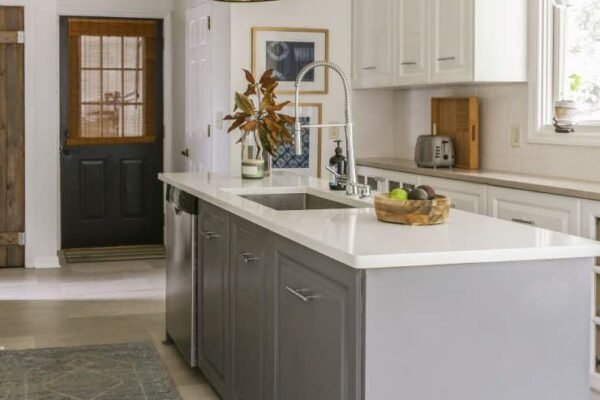
I once helped a friend paint her 10×10 bedroom, and when we finished, she walked in and said it felt twice as big. Same furniture, same windows, same square footage. The only change was going from a dark, muddy beige to a soft, light color with the right finish. Paint is basically optical illusion in a can.
But ‘paint it white’ is lazy advice. The best paint color for making a small room look bigger depends on the light, the purpose of the room, and yes, your actual taste. You don’t have to live in a white box. Here’s what really works.
Best Paint Color for Making a Small Room Look Bigger: The Winners
Light colors recede visually, making walls feel farther away; that’s the core principle. But the magic is in the undertones. Cool-leaning light colors, soft blues, pale grays, gentle greens, recede more than warm ones. A pale blue-gray room feels larger than the same room in creamy beige, even at identical lightness.
My top picks after years of painting small spaces: soft white with a hint of warmth for north-facing rooms, pale blue-gray for south-facing rooms with strong light, and light sage green for rooms where you want calm without coldness. All three keep the room feeling open while having actual personality.
- Soft white (not stark white). Warm whites feel bright without the sterile hospital vibe. Best all-around choice for small rooms.
- Pale blue-gray. Recedes visually more than almost any color. Makes walls feel farther away, especially in well-lit rooms.
- Light sage or eucalyptus green. Calming, natural, and light enough to keep things airy. Works beautifully in bedrooms.
- Warm light gray (greige). The modern neutral that goes with everything. Keeps rooms feeling open while hiding scuffs better than white.
- Pale blush or peach. Adds warmth to dark, north-facing small rooms without closing them in. Surprisingly effective.
- Finish matters too. Eggshell or satin reflects more light than flat paint, subtly enhancing the spacious feel.
Techniques That Multiply the Effect
Color is only half the equation. How you apply it matters just as much. The single most effective trick: paint the ceiling the same color as the walls, or a slightly lighter tint of it. Eliminating the harsh line where wall meets ceiling removes a visual boundary, and the room feels taller and more continuous.
Painting trim the same color as the walls (a monochromatic scheme) has a similar effect. Contrasting white trim chops the room into segments; matching trim lets the eye glide uninterrupted. It feels counterintuitive, but it works dramatically in small spaces.
- Paint ceiling and walls the same color. Removes the visual ‘lid’ on the room. The single highest-impact trick for low ceilings.
- Match trim to walls. Same-color trim in a slightly higher sheen keeps things seamless while still looking finished.
- Extend color onto the ceiling. For very small rooms like powder baths, wrapping one color everywhere makes boundaries disappear entirely.
- Use one color throughout connected spaces. A small living room flowing into a small dining room feels twice as big in one continuous color.
- Go bold in tiny powder rooms. Counterintuitive exception: jewel-box powder rooms can handle dark, dramatic colors because they’re experienced briefly. Save the light colors for rooms you live in.
- Test with large swatches. Paint 2×2 foot test boards and move them around the room for 48 hours. Colors shift dramatically with light.
Colors and Mistakes to Avoid in Small Rooms
Dark, saturated colors advance visually; they make walls feel closer. That’s not always bad (cozy dens are wonderful), but if your goal is spaciousness, avoid deep reds, navy, forest green, and chocolate brown on all four walls of a small room. An accent wall in a dark color is fine and can even add depth, but keep the other three walls light.
The other mistake is choosing a color that’s light but wrong for the light. A cool gray in a north-facing room with no direct sun can feel icy and cave-like. In low-light rooms, lean warm: creamy whites, warm greiges, soft peaches. Match the color temperature to the light you have.
- Avoid dark colors on all walls. They visually shrink the room. Use them as accents only when spaciousness is the goal.
- Don’t ignore undertones. That ‘light gray’ with purple undertones will look lavender in your lighting. Check undertones in the actual room.
- Skip high-contrast trim. Bright white trim against colored walls segments a small room. Blend instead.
- Don’t forget the fifth wall. A dark ceiling presses down on a room. Keep ceilings light, or match them to pale walls.
- Avoid flat paint in traffic areas. It marks easily and can’t be cleaned, which makes small rooms look dingy fast. Eggshell minimum.
Frequently Asked Questions
Does painting a small room white really make it look bigger?
Yes, but soft whites outperform stark whites, which can feel cold and emphasize shadows. Warm whites and very light neutrals give you the spacious effect with more comfort.
Should the ceiling be white or the wall color?
For maximum spaciousness, paint the ceiling the same color as the walls or a half-tint lighter. The traditional bright-white ceiling creates a visual boundary that makes rooms feel smaller.
What color makes a small bedroom look bigger and cozy?
Light warm neutrals like warm greige, soft cream, or pale warm gray. They keep the room feeling open while the warm undertones add coziness that cool colors lack.
Knowing When to DIY and When to Call a Pro
I’m a committed DIYer, but the smartest DIY skill is knowing your limits. Some jobs reward doing them yourself enormously; others punish overconfidence with costs far exceeding the pro’s quote. Here’s how I decide.
- DIY when mistakes are cheap. Painting, patching, basic installs: worst case is redoing it. The learning is worth it.
- Call a pro for safety systems. Electrical panels, gas lines, structural work, major plumbing: mistakes here endanger people, not just aesthetics.
- Consider your time honestly. A pro’s 4-hour job might take you 16. If those 16 hours matter more elsewhere, hiring out is the smart move.
- Get three quotes. For any hired work, three quotes reveal the fair price and the outliers. Never accept the first number.
- Go deeper: For visualizing colors in your space, try Sherwin-Williams color tools for authoritative detail on this topic.
The bottom line: The best paint color for making a small room look bigger is a light, slightly cool neutral, applied with the ceiling and trim blended in rather than contrasting. It’s part color science, part visual trickery, and it genuinely works. A $100 paint job can make a room feel twice its size, which is the cheapest square footage you’ll ever buy.